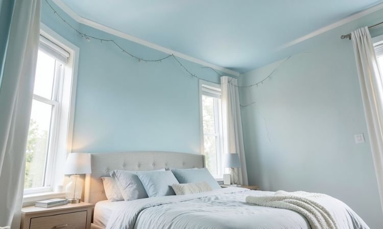
Most people default to “ceiling white”—but the right ceiling color can soften a room, add height, or tie a space together without making it feel closed in.
The best choices depend on your wall color, natural light, and ceiling height (standard 8–9 feet in most homes).
These 10 paint colors are tested in real homes—not showrooms—and work with common wall tones like warm white, greige, and soft gray. All are from major brands and available in flat or matte finishes, which hide imperfections better than sheen.
Why Ceiling Color Matters
It affects perceived height: Light, warm ceilings feel higher; cool or dark tones can feel cozy but may lower the space visually.
It ties the room together: A ceiling that coordinates with walls creates flow—especially in open-plan homes.
Flat finishes are practical: Ceilings collect dust and show flaws—flat paint hides both better than eggshell or satin.
Undertones must match: A cool white ceiling over warm walls creates a chalky disconnect. Consistency matters.
10 Best Ceiling Paint Colors That Actually Work in Real Rooms
All recommendations assume standard 8–9 ft ceilings and average natural light.
1. Benjamin Moore White Dove OC-17
A soft, warm white with subtle cream undertones. Works beautifully over warm whites, beiges, and greiges. Doesn’t yellow over time like stark bright whites.
Use in north-facing rooms or spaces with limited sun. Flat finish recommended. Avoid pairing with cool gray walls—it will look dingy.
2. Sherwin-Williams Alabaster SW 7008
A balanced, nearly neutral white with a whisper of warmth. One of the most versatile ceiling colors—pairs with everything from navy to sage to warm oak floors.
Slightly warmer than Pure White, cooler than Creamy. Ideal for open-concept homes where the ceiling flows between rooms with different wall colors.
3. Benjamin Moore Cloud White OC-40
Warmer than White Dove, with a hint of beige. Excellent for traditional homes or rooms with lots of wood trim. Makes ceilings feel airy but not sterile.
Best in south- or west-facing rooms with strong afternoon light. Avoid in small, dim spaces—it can feel too heavy if lighting is poor.
4. Sherwin-Williams Pure White SW 7005
A clean, slightly cool white that reads as “true” in most lighting. Crisp without being clinical. Works well with cool grays, blues, and modern interiors.
Use when you want contrast against warm walls—or to brighten a shadowed hallway. Not ideal over beige or taupe—it can look bluish.
5. Benjamin Moore Simply White OC-117
Brighter and cleaner than White Dove, with a faint yellow undertone. Reflects more light, making it great for low-ceiling basements or hallways under 8 feet.
Can appear stark in all-white rooms—soften with warm wood furniture or textured rugs. Avoid in rooms with cool-toned marble or tile.
6. Sherwin-Williams Egret White SW 7570
A soft greige-leaning white with quiet warmth. Bridges the gap between true white and beige. Excellent over greige walls or in transitional spaces like foyers.
More forgiving than pure white in imperfect lighting. Pairs well with black fixtures or brass hardware without clashing.
7. Benjamin Moore Swiss Coffee OC-45
A creamy, warm off-white with depth. Feels inviting in bedrooms or dining rooms. Not too yellow—just enough warmth to feel cozy.
Best in rooms with ample natural light. In dim spaces, it may read as too beige—test a large swatch first.
8. Sherwin-Williams Snowbound SW 7004
A popular near-neutral with a faint violet-gray undertone. Looks clean in modern spaces but can feel cold in traditional homes.
Works well with white oak floors and black accents. Avoid over warm terracotta or red-toned walls—it will look purplish.
9. Benjamin Moore Pale Oak OC-20
Technically a wall color, but diluted 25% with White Diamond, it makes a stunning ceiling in warm, earthy rooms. Adds subtle depth without lowering the space.
Use only in rooms with high ceilings (9+ feet) and abundant light. Never use full strength—it will feel cave-like overhead.
10. Sherwin-Williams Repose Gray SW 7015 (Ceiling Version)
For those wanting a true colored ceiling: mix Repose Gray with 50% Pure White. The result is a soft, barely-there gray that adds sophistication in modern lofts or high-ceiling studies.
Only use in rooms with 9+ foot ceilings and strong ambient light. Never pair with dark walls—it will feel oppressive.
Common Mistakes and Fixes
- Using the same white for walls and ceiling
Fix: Ceilings need a slightly lighter or warmer version—identical color flattens the space. - Ignoring lighting direction
Fix: North light = cool; south/west = warm. Choose ceiling white that complements your window exposure. - Skipping large samples
Fix: Paint 2’x2′ swatches on the ceiling—not just paper. View at morning, noon, and night. - Choosing glossy finishes
Fix: Always use flat or matte. Sheen highlights every crack, cobweb, and texture flaw. - Matching ceiling to trim exactly
Fix: Trim can be semi-gloss; ceiling should be flat. Slight tonal variation is normal and desirable.
Finish With Intention, Not Default
The best ceiling color isn’t the whitest—it’s the one that makes your room feel balanced. Start with your wall color and lighting, then choose a ceiling white that supports it. When in doubt, go slightly warmer than you think you need.
Which of these 10 options fits your room’s light and palette? Test one sample—your ceiling will thank you.