For decades, the ceiling was the room nobody thought about. White — or more precisely, off-white — was the default, the safe choice, the thing you did without really deciding to do it. The walls got the colour, the floors got the texture, and the ceiling got a coat of whatever the paint shop had pre-mixed in bulk. It was functional. It was inoffensive. And increasingly, it is starting to look like the design equivalent of beige carpet: not wrong, exactly, but a missed opportunity.
Painted ceilings are having a significant moment right now, and it is not a passing trend driven by a single viral interior. It is a broader shift in how people think about their rooms — as fully three-dimensional spaces where every surface has design potential, not just the four vertical ones. Interior designers have known this for years. The rest of us are catching up.
This guide explains the concept behind the painted ceiling, the psychology of colour at ceiling height, and exactly which colours work best in each room of the house — so you can make a confident decision rather than painting a test patch and staring at it for three weeks.
Why Designers Call the Ceiling the Fifth Wall
The term “fifth wall” has been in use among interior designers for years, but it has only recently entered mainstream home decor conversation. The idea is straightforward: a room has six surfaces — four walls, a floor, and a ceiling. The floor is almost always addressed with intention, whether through flooring material, rugs, or both. The walls are addressed through paint, wallpaper, or panelling. The ceiling, in most homes, is left as an afterthought.
What makes this particularly surprising is that the ceiling takes up more of your visual field than most people realise. When you are lying in bed, sitting on a sofa, or reclining in a bath, the ceiling is directly in your line of sight. It is not a background element — it is a primary surface in the rooms where you relax most.
A painted ceiling does two things depending on the colour and technique used. A ceiling painted in a darker tone than the walls visually lowers the ceiling height, making a room feel more enclosed, intimate, and cosy — which is desirable in a bedroom, a dining room, or a reading nook, but less so in a small kitchen. A ceiling painted in a lighter tone than the walls — or in the same colour as the walls — pushes the ceiling visually upward, making the room feel taller and more expansive. Understanding which effect you want in each room is the starting point for choosing the right colour.
The Bedroom: Why Soft Tones Work Best
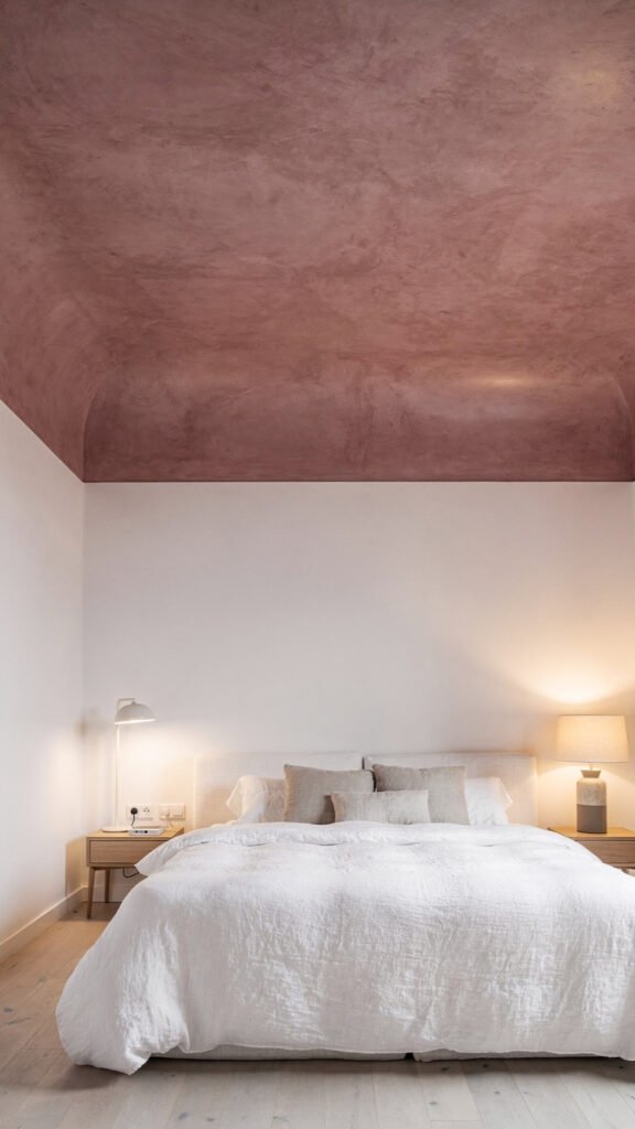
The bedroom ceiling is the surface you look at most in any room of the house. It is the last thing you see before sleep and the first thing you see on waking. This makes it more important from a psychological standpoint than the bedroom walls — and yet it is the surface most consistently ignored in bedroom decorating.
The psychology of ceiling colour in a sleep environment is well established. Soft, muted tones reduce visual stimulation and signal rest to the brain. Hard, bright, or highly saturated colours — even ones that look appealing on a wall — are counterproductive on a ceiling in a room designed for sleep.
The colours that work best on bedroom ceilings are the ones that feel like a natural extension of the sky at dusk or the walls of a warm, sheltered space:
- Dusty pink or blush: Warm and enveloping, dusty pink on a bedroom ceiling creates an intimate cocoon effect that works particularly well in rooms with white or cream walls. It reads as sophisticated rather than sweet when the tone is muted rather than bright.
- Sage green: One of the most versatile ceiling colours available, sage green sits in the neutral-adjacent territory that reads as neither clearly warm nor clearly cool. It pairs naturally with natural wood, linen, and white, and creates a calm, grounded atmosphere.
- Warm terracotta: Used at ceiling height in a toned-down, chalky form rather than the full-saturated version, terracotta adds warmth and character without the visual heaviness it might carry on all four walls.
- Pale sky blue: At its lightest, a pale blue ceiling mimics an overcast sky and gives the room a feeling of airiness. At a slightly deeper tone, it creates a more dramatic canopy effect that works well in rooms with high ceilings.
The general rule for bedroom ceilings is to choose a tone that is two to three shades lighter than the wall colour if you want the room to feel airy, or the same tone as the walls if you want the room to feel immersive and cocooning. Avoid going darker than the walls unless the ceiling height is genuinely generous — above 9 feet — and you specifically want a dramatic, enclosing effect.
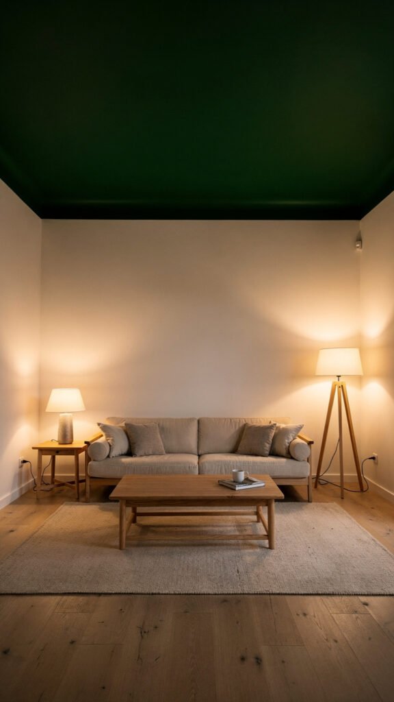
The Living Room: Go Bolder Than You Think
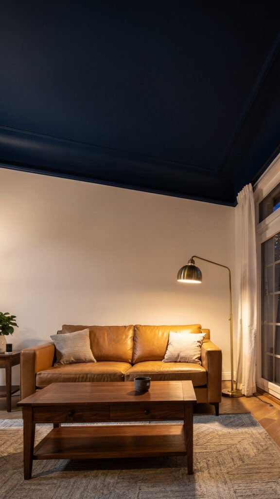
The living room is where most people are most afraid to experiment with ceiling colour, and it is also the room where a bold ceiling choice pays off most visibly. Living rooms tend to have more generous ceiling heights than bedrooms, more architectural features worth framing, and a scale that can absorb a strong colour without feeling oppressive.
The rule of thumb for living room ceiling colour is directly linked to ceiling height. If your living room has ceilings above 9 feet, you have considerable latitude to go dark — navy blue, deep forest green, charcoal, or rich terracotta are all valid choices that create a dramatic, considered atmosphere. If your ceiling is standard height at around 8 feet, lighter tones of a bold colour — dusty blue, warm sage, soft terracotta — give you the character of a coloured ceiling without the risk of the room feeling compressed.
The colours that consistently perform best in living rooms:
- Navy blue: Against cream or white walls, a navy ceiling creates a sophisticated, library-like atmosphere. It works particularly well in rooms with warm-toned furniture — tan leather, natural wood, brass accents — where the contrast between the warm room and the cool ceiling creates visual tension in the best sense.
- Deep forest green: Green at ceiling height reads differently than green on a wall. It brings the outside in, creates a sense of organic enclosure, and pairs naturally with almost every neutral palette currently in use in living room design.
- Warm terracotta: A terracotta ceiling in a living room with white walls and natural materials feels Mediterranean and sun-drenched without any of the overt thematic references that terracotta wall paint can sometimes carry.
One technique that works particularly well in living rooms is painting the ceiling the same colour as an accent wall rather than creating a completely independent ceiling colour. This approach wraps the room in the colour, creating an enveloping effect that feels intentional and cohesive rather than experimental.
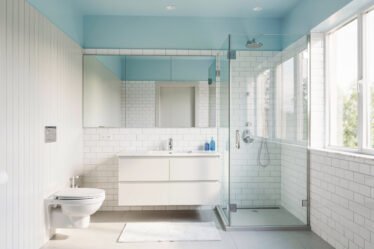
The Bathroom: The Easiest Room to Experiment In
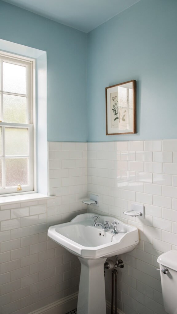
If you want to try a painted ceiling for the first time, start in the bathroom. Of all the rooms in the house, the bathroom is the lowest-risk environment for a bold ceiling colour decision. The reasons are straightforward: the space is small, which means the ceiling is always in close visual proximity to the walls and fixtures; the room has fewer furnishings to clash with a colour choice; and the financial cost of repainting if you dislike the result is minimal.
Bathrooms also have a functional advantage for painted ceilings — the ceiling is genuinely part of the visual experience in a way it is not in a living room or kitchen. A bath or shower involves lying or standing in a contained space while looking up, which means the ceiling contributes meaningfully to how the room feels to be in.
The best ceiling colours for bathrooms:
- Sky blue or soft aqua: The most intuitive bathroom ceiling colour, sky blue creates an outdoor, open-air feeling that is particularly effective in bathrooms without windows or with limited natural light.
- Mint green: Fresh, clean, and slightly unexpected, mint green on a bathroom ceiling works beautifully with white subway tile, chrome fixtures, and natural wood accents.
- Warm cream or soft yellow: In bathrooms that lack natural warmth — north-facing, artificially lit, or tiled in cool greys — a warm cream or pale yellow ceiling adds the warmth that the walls and floor cannot provide.
- Dusty lilac or pale blush: For a bathroom with French country or vintage aesthetic ambitions, a soft lilac or blush ceiling adds the feminine, romantic quality that is difficult to achieve through accessories alone.
Because bathrooms are small, the ceiling colour will have a proportionally larger impact than it would in a larger room. A colour that reads as very subtle in a large living room can be quite striking in a compact bathroom — which is part of what makes the bathroom such a rewarding place to experiment.
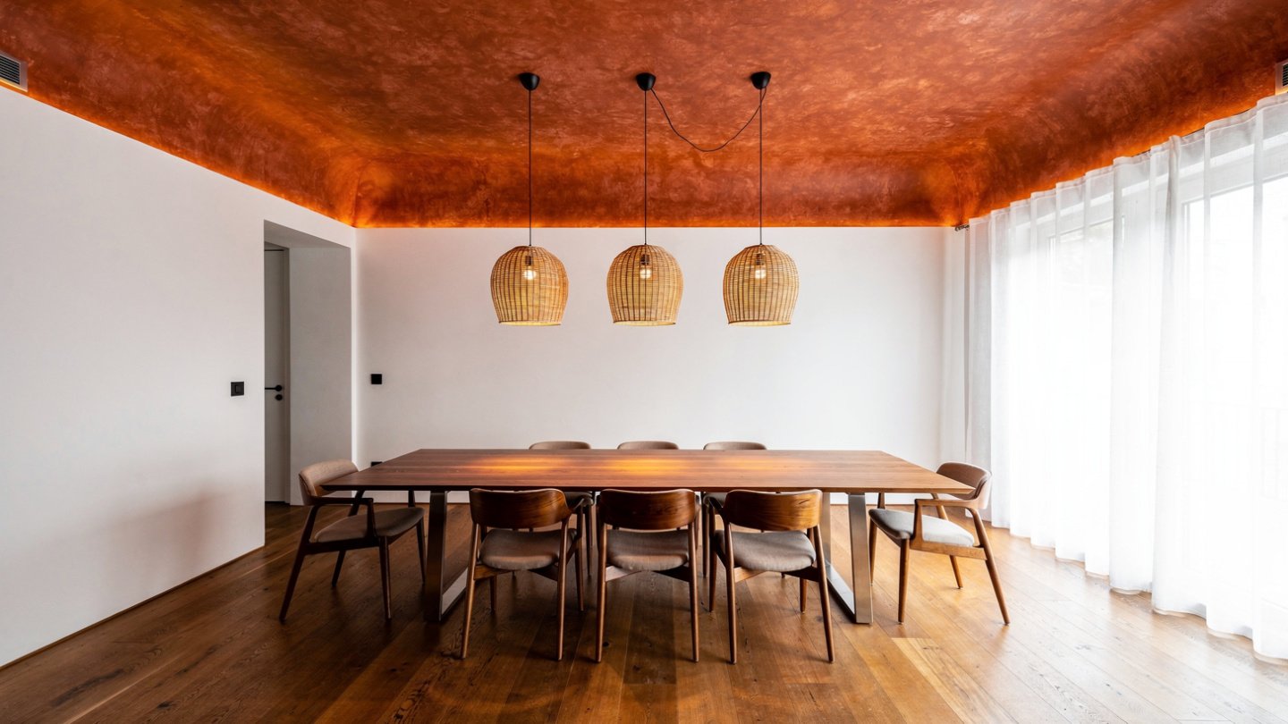
The Dining Room: The Most Dramatic Opportunity in the House
Of all the rooms in a home, the dining room makes the strongest case for a bold, dark ceiling colour. The reason is structural: dining rooms are lit from above, with a pendant or chandelier positioned directly over the dining table. This means that during every meal, every dinner party, and every family gathering, the ceiling is constantly and inevitably in view. It is not a background surface in a dining room — it is a backdrop for the entire social experience of the space.
Dark ceiling colours in dining rooms — deep burgundy, forest green, slate blue, charcoal, even black — create an intimate, enclosing atmosphere that is specifically suited to evening dining. The effect is similar to what a tent or a canopy does to an outdoor dinner — it defines the space, focuses attention inward, and makes the table feel like the centre of its own contained world.
The dining room is also typically one of the less-used rooms in the house during daylight hours, which means the potential downside of a dark ceiling — a slightly reduced sense of light and space — is felt less acutely. For a room used primarily in the evening under artificial light, a dark ceiling is not a drawback. It is an asset.
If you are uncertain about committing to a very dark dining room ceiling, deep jewel tones — bottle green, deep teal, dark plum — offer the drama of a dark ceiling with slightly more visual warmth than a pure charcoal or navy approach.
The Practical Guide: How to Actually Paint a Ceiling Without Making a Mess
Choosing the right colour is only half the challenge. Ceiling painting is technically more demanding than wall painting, and a poor application will undermine even the best colour choice. Here is what you need to know before you open the tin.
Use ceiling-specific paint. Ceiling paint is formulated differently from wall paint. It is thicker, which reduces drips, and it almost always comes in a flat or matt finish. This matters because a flat finish on the ceiling hides surface imperfections — the small bumps, roller marks, and texture variations that are invisible under a matt finish but glaringly obvious under any sheen. Even if you are using a coloured ceiling paint, insist on a flat finish. Any paint retailer can tint ceiling paint to a custom colour.
Cut in before you roll. Use an angled brush to cut in along the cornice or ceiling edge before applying paint with a roller. Work in sections — cut in about a metre at a time, then immediately follow with the roller so the cut-in edge and the rolled section are still wet when they meet. This prevents a visible hard line between the brushed and rolled sections, which is the most common technical flaw in DIY ceiling painting.
Use a roller with a long extension handle. Working from a ladder is less efficient and less comfortable than working from the floor with an extended roller. A 1.2 to 1.5 metre extension handle allows you to reach the entire ceiling without repositioning a ladder every few minutes, and it gives you better control over pressure and direction.
Always apply two coats, regardless of the colour. This is not negotiable. A single coat of ceiling paint — even a high-coverage formula — will show patchy, uneven coverage when dry, particularly with darker colours. The second coat should be applied once the first is fully dry, typically after two to four hours, and applied in the opposite direction to the first coat to ensure even coverage across the entire surface.
Protect the room properly before you start. Ceiling paint drips more than wall paint because gravity works against you. Cover every horizontal surface with dust sheets, tape plastic sheeting over any furniture you cannot remove, and apply painter’s tape along the top of the walls where they meet the ceiling. The preparation takes longer than most people expect, but it is faster than cleaning dried paint off a sofa.
Frequently Asked Questions
Should I paint my ceiling the same color as the walls?
Painting the ceiling the same colour as the walls — sometimes called a “colour drenching” technique — creates an immersive, enveloping effect that makes a room feel cocooning and intentional. It works best with mid-range tones: soft greens, warm terracottas, dusty blues. Very dark colours used on all six surfaces can make a room feel oppressive unless the ceiling height is generous, while very light colours lose the impact that makes ceiling painting worth doing in the first place.
What colors make a ceiling look higher?
Light colours — particularly whites, very pale blues, and soft creams — make a ceiling appear higher than it is by maximising light reflection. Painting the ceiling slightly lighter than the walls increases this effect. Vertical stripes on the walls also draw the eye upward, contributing to the perception of height. Conversely, a dark ceiling colour visually lowers the ceiling, which is desirable in some rooms and counterproductive in others.
Is it hard to paint a ceiling a color?
Painting a ceiling is more physically demanding than painting a wall but not technically difficult. The main challenges are avoiding drips, achieving even coverage with a roller, and cutting in cleanly along the cornice edge. Using ceiling-specific flat-finish paint, a roller with an extension handle, and applying two coats will produce a professional-looking result for most DIYers. The preparation — covering furniture and applying painter’s tape — takes longer than the painting itself.
What is the most popular ceiling color right now?
Sage green and dusty blue are currently the most widely used coloured ceiling choices across bedroom and living room applications. Deep forest green is particularly dominant in dining rooms and home office spaces. Warm terracotta is growing rapidly as an alternative to the cooler tones that have dominated interior design for the past decade. In bathrooms, sky blue and soft aqua remain consistent favourites.
Final Thoughts
The white ceiling is not going away — it still works, it still has its place, and in many rooms it is genuinely the right choice. But the assumption that the ceiling does not need to be decided about is worth challenging the next time you are refreshing any room in your home.
The ceiling is a full surface with real design potential. In a bedroom, a soft coloured ceiling transforms the quality of the space you sleep in. In a dining room, a deep ceiling colour elevates an ordinary meal into something that feels like an occasion. In a bathroom, a painted ceiling is the single change with the highest impact-to-effort ratio available to any decorator working without a renovation budget.
Choose the room where the ceiling is most visible to you. Pick a tone that serves what the room is for. Follow the practical steps to apply it properly. The result will change how the room feels in ways that four painted walls simply cannot match.